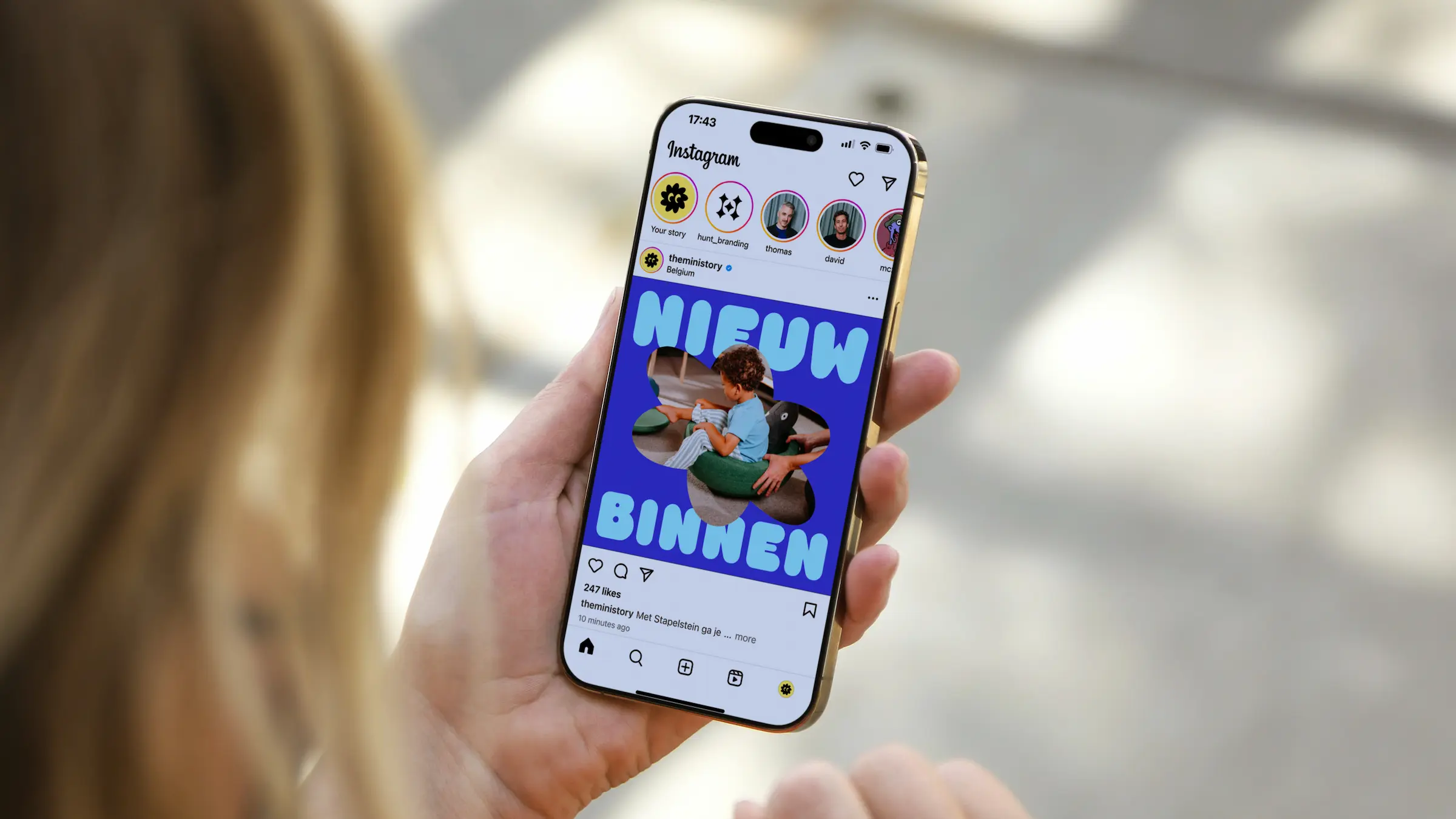
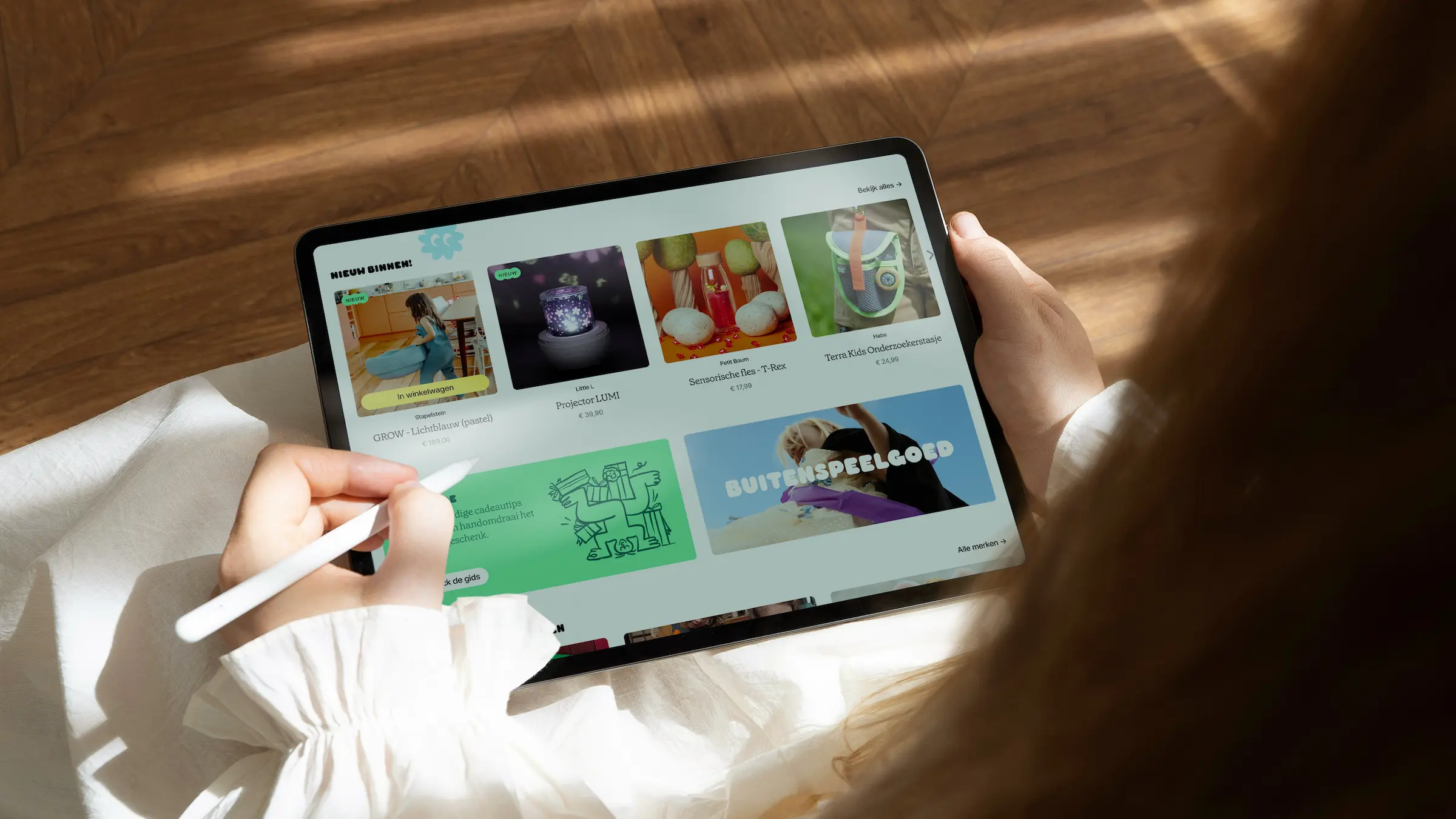
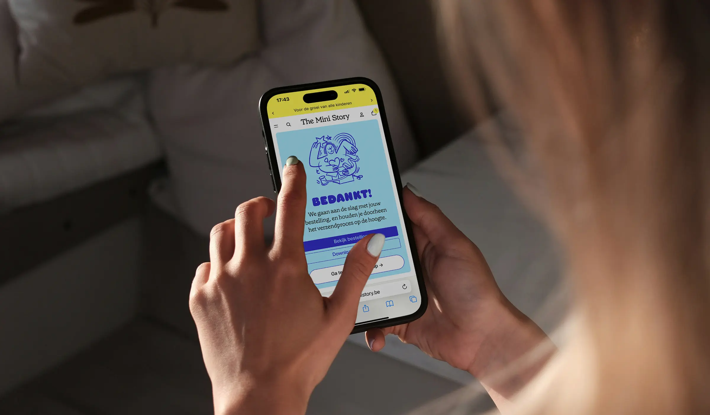
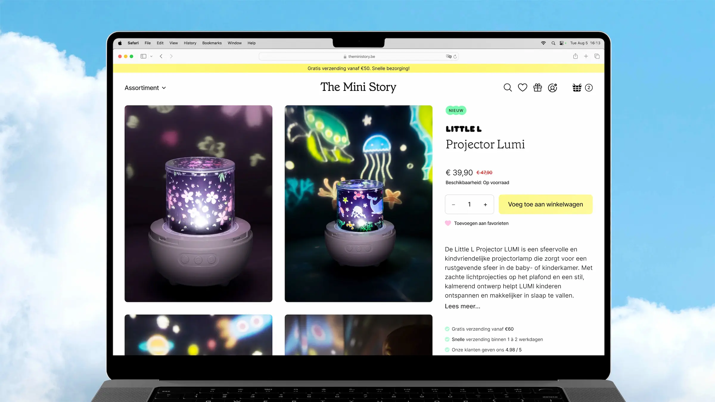
The Mini Story, a webshop for sensory, educational and open ended toys, knocked on our door after an acquisition, asking us to translate their story into a fresh new identity. We helped them communicate their inspiring mission strongly and consistently.
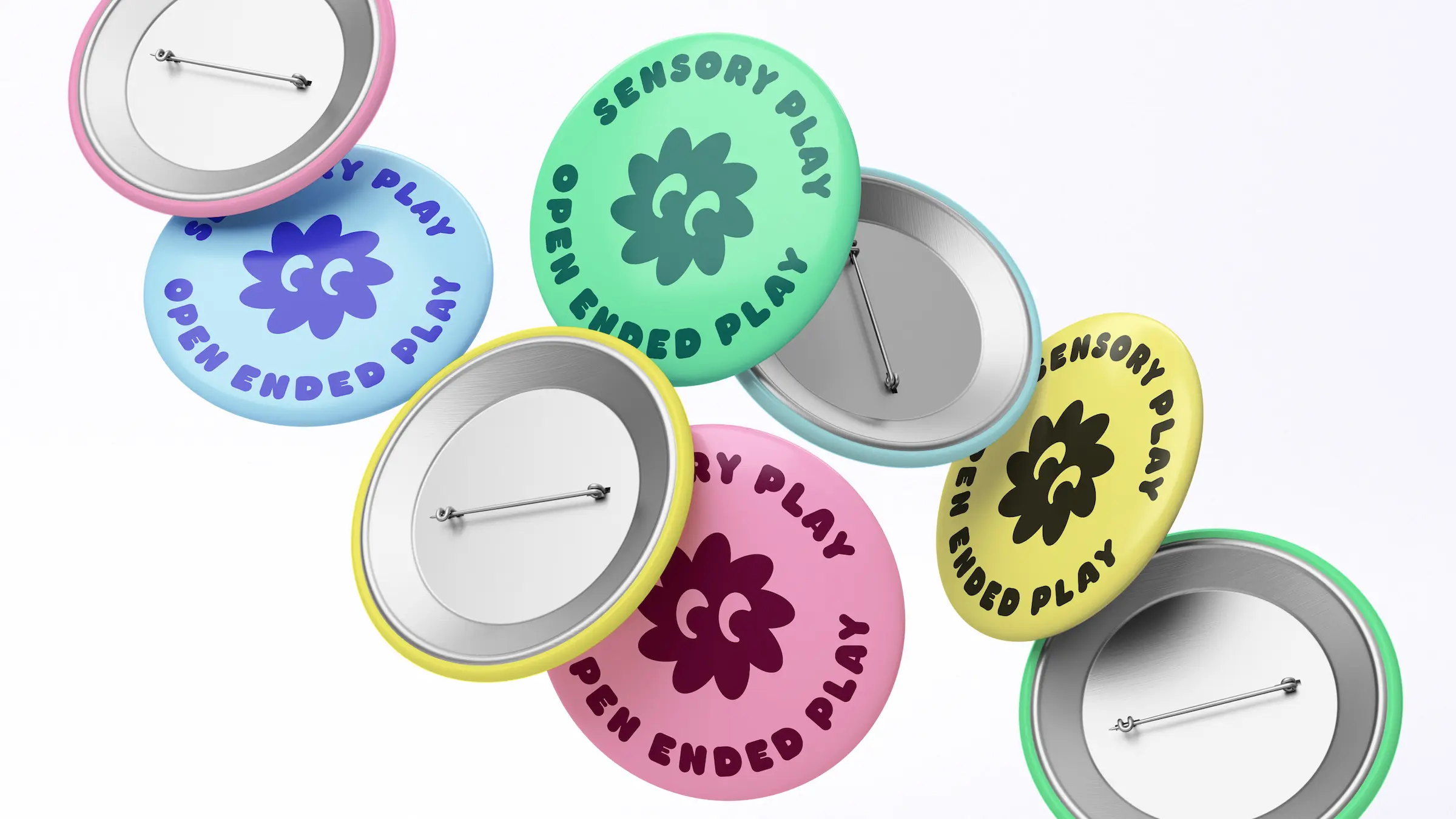
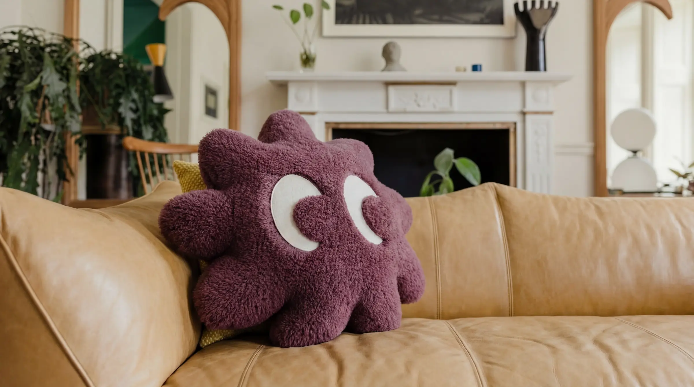
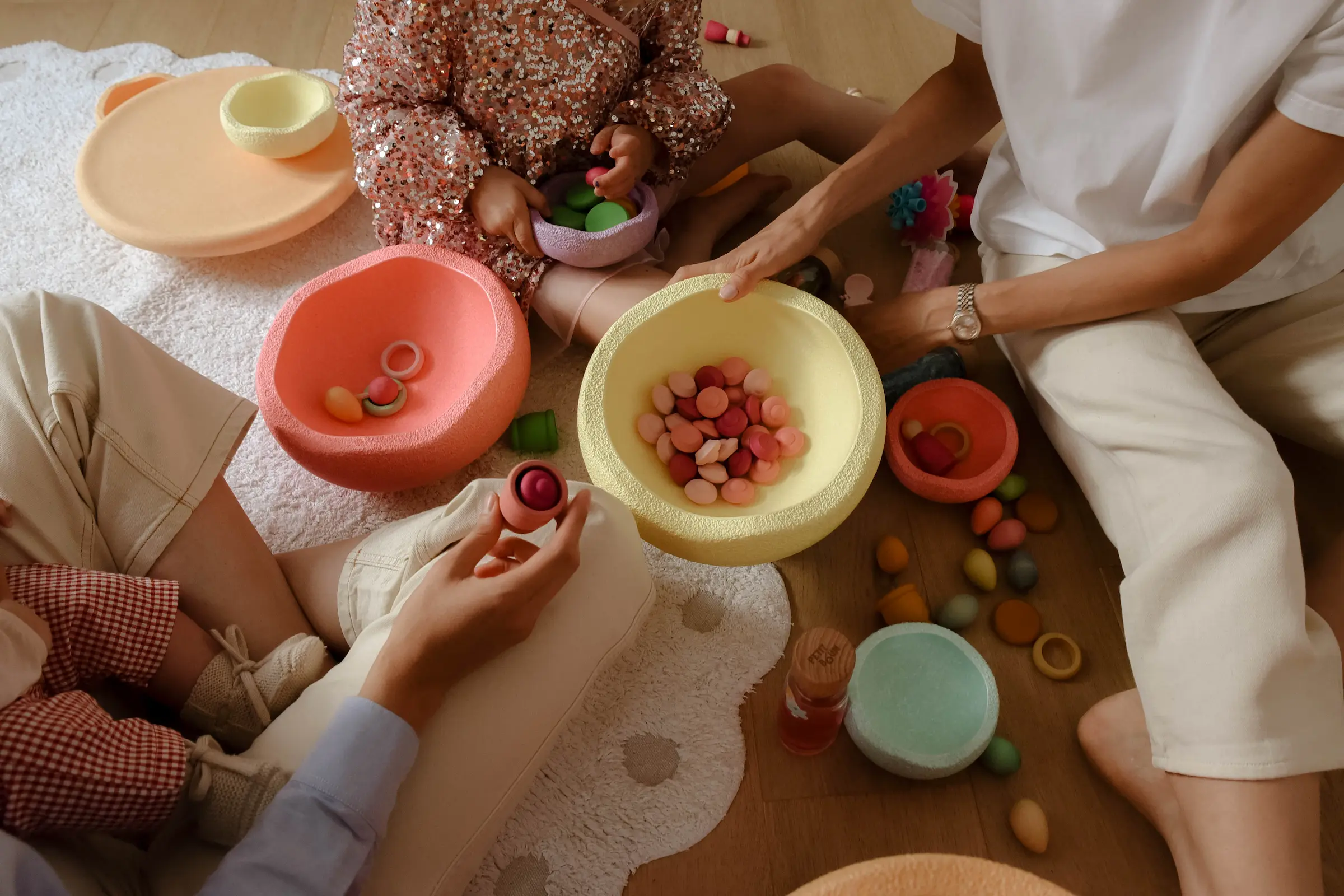
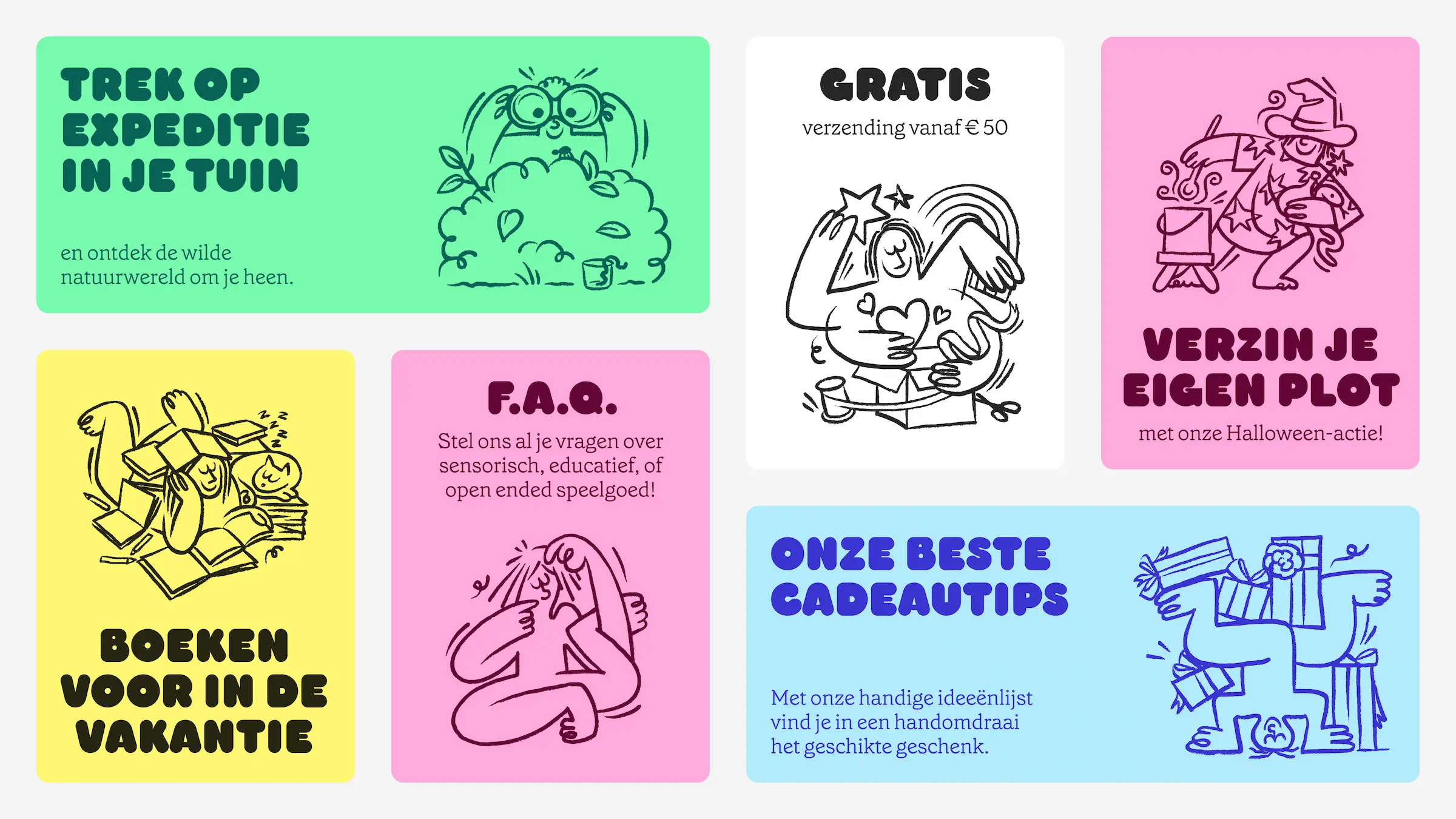
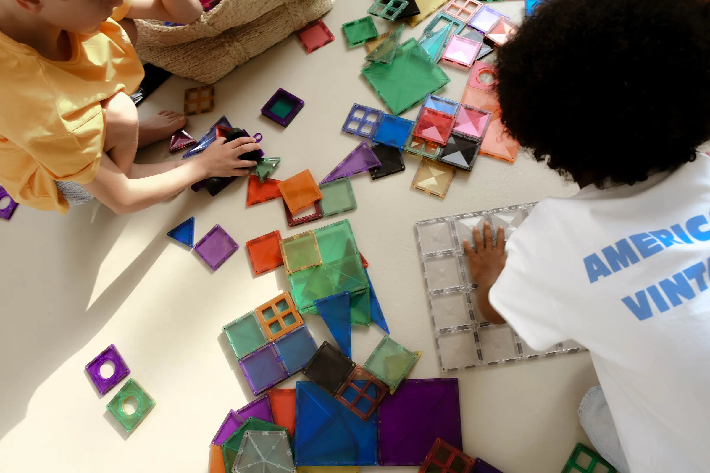
What attracted us was their sincere belief in play as an engine for growth. In their own words, "Fun is the engine behind everything, and from there, learning comes almost naturally." Encouraging that playful curiosity is the common thread in the products they sell, and also the strategic pillar that we extended everywhere: in typography, color, images, animation, web design, social media, ... And thus also in their new mascot: a small fluffy ball with an inquisitive look that symbolizes the playful way in which children discover their world.
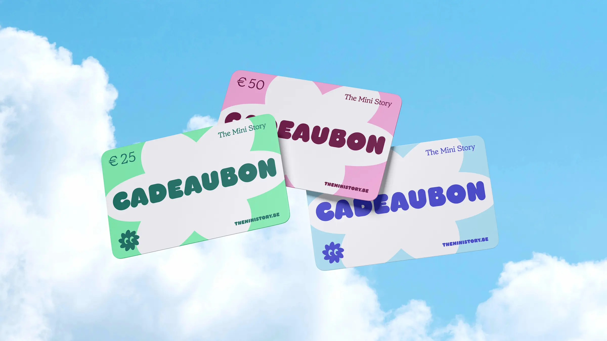
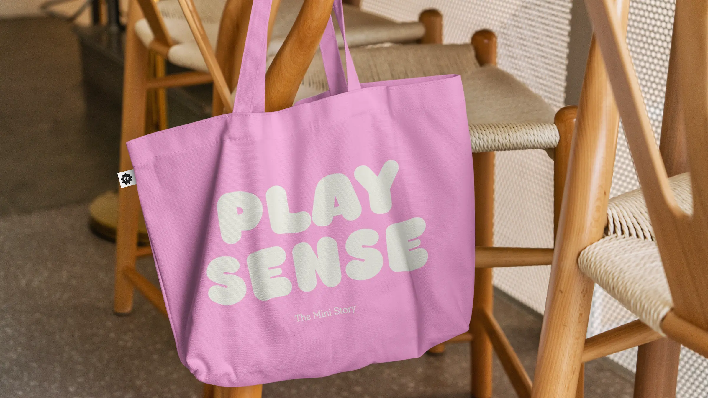
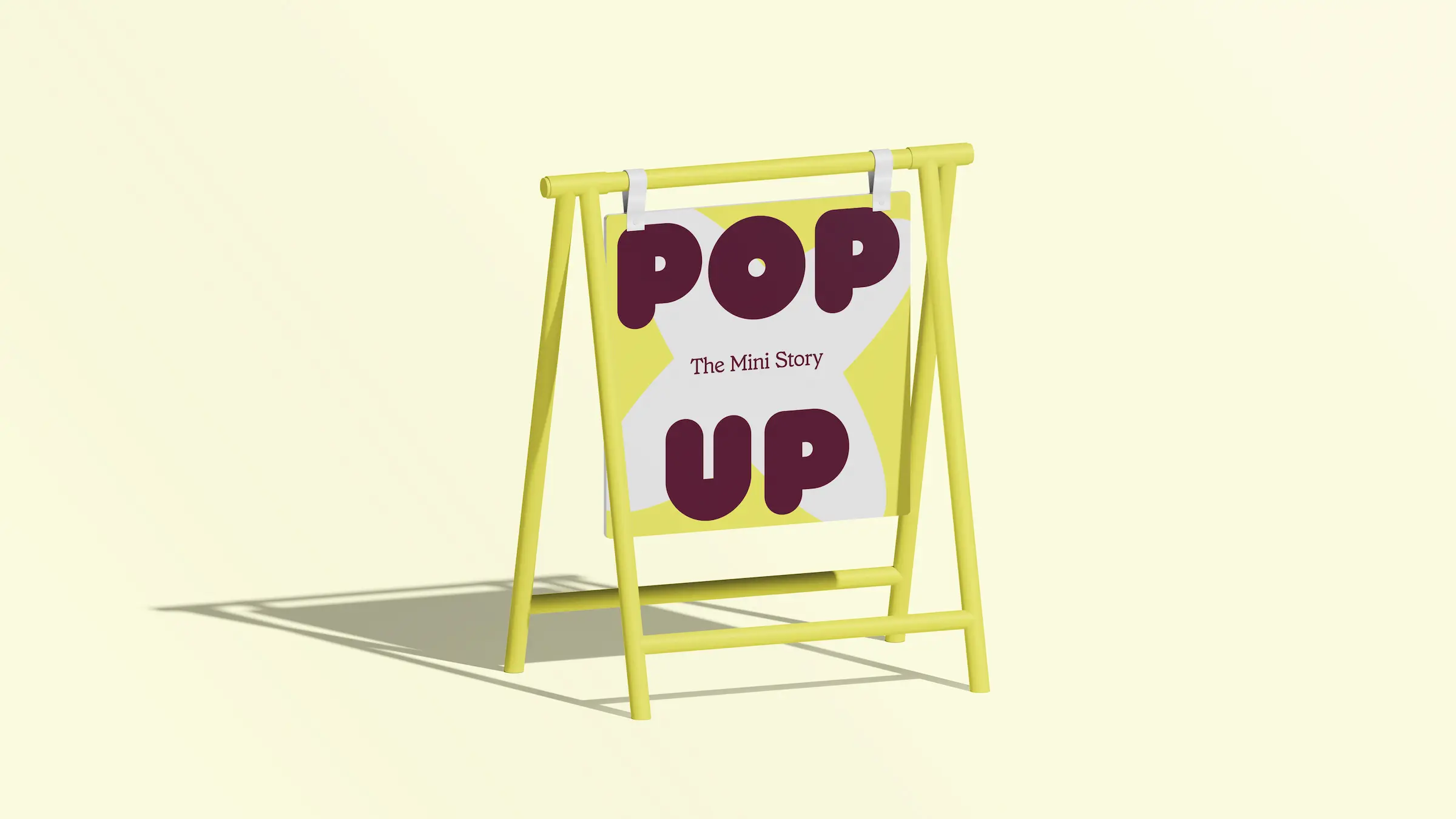
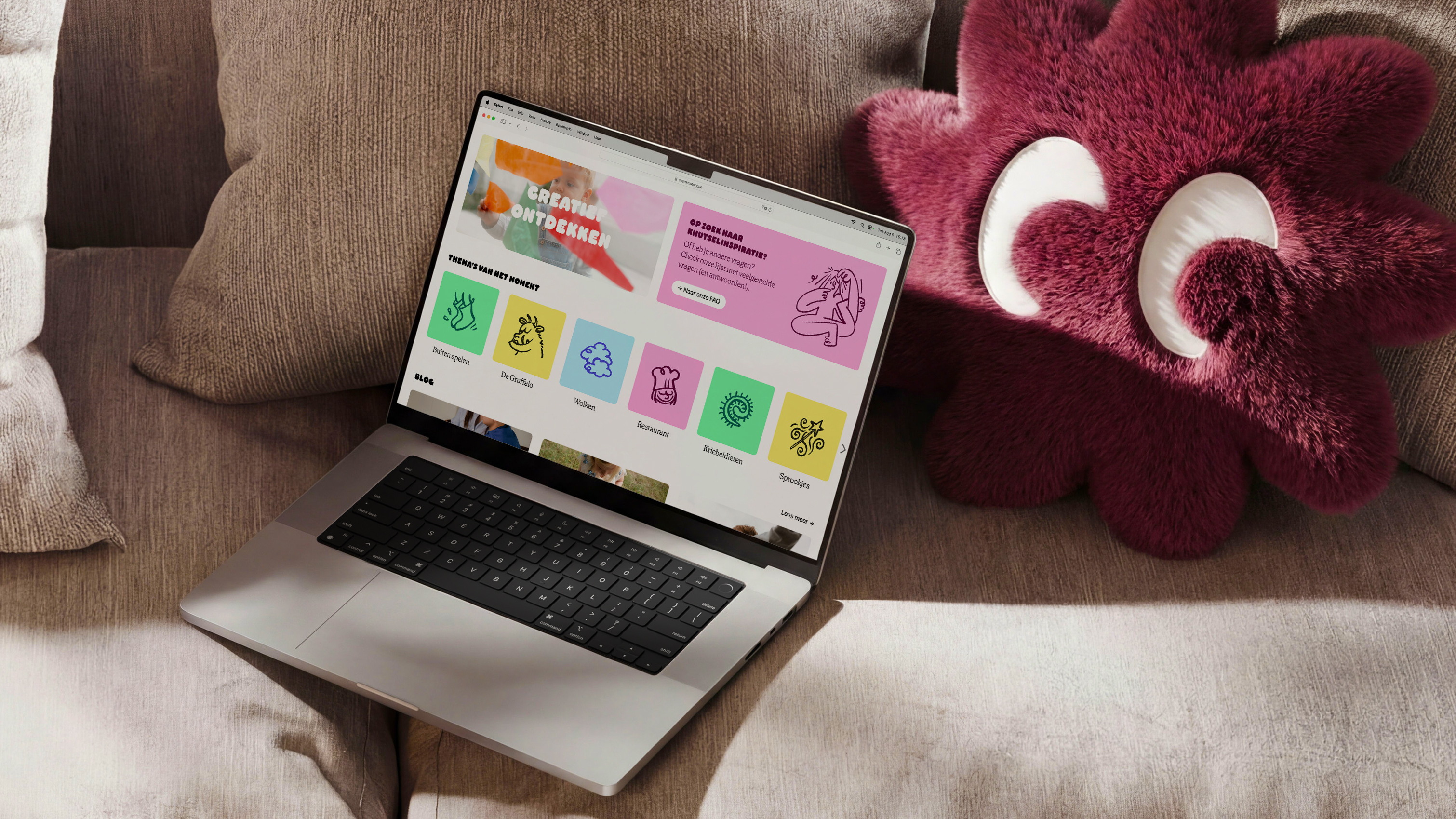
We extended the same philosophy into the other elements of their identity. In the typography we chose two fonts that contrast strikingly with each other: A bold, rounded font that symbolizes fun and enthusiasm; and a more classic, rather refined font that embodies the self-aware, learning character of the brand. Together they form layouts that are both playful and inspiring.
Illustrations are also an important pillar within The Mini Story's brand universe. Not everyone is yet familiar with the terms "open ended" and "sensory" toys, and the drawings help to visualize these concepts in an approachable way. In addition, they help define The Mini Story's unique brand, and are a rewarding element to inject instant fun and enthusiasm.
With this all-encompassing rebrand, we ensure that The Mini Story can tell their story and mission at every touchpoint, in their unique way. At Hunt, we love nothing more than helping brands build their own "brand world" in this way. Sparked? Let's explore new worlds together.